Hi! My names Phil Loyer and I wanted every to get a view into the way Wyvern Gaming designs our games. Out first game was a huge success, as I’m sure most of you know that that is Cthulhu: A Deck Building Game. While the game was great and was visually appealing due to the art, there was still room for improvement. Our card layouts successfully conveyed the game play of the game but it was really all the well-organized or visually appealing to some people. So, we have taken a shot at applying a new card layout which will give a better idea of what a card is at a glance, such as spell, equipment, actions, gear, locations, and allies. First let’s take a look at the original card design.
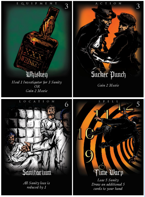
These cards look good and do convey the necessary information in order to play the game. We wanted a dark theme when we did this. However, based on player feedback many felt that it was a little too dark. So, we decided we would change it up a little and give each type of card a distinctive color so that players can pick out each card type quickly. Let’s take a look at the new design with the same 4 cards.
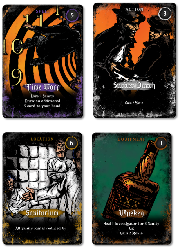
All the information is still clearly readable, but now they are easily differentiated by color so they can be picked out more easily. For example, if one were playing the magician they would most likely focus on spell cards, so they would be on the look out for purple cards in that case. The theme over all is still dark but it also makes the card art pop a little more than it did previously.